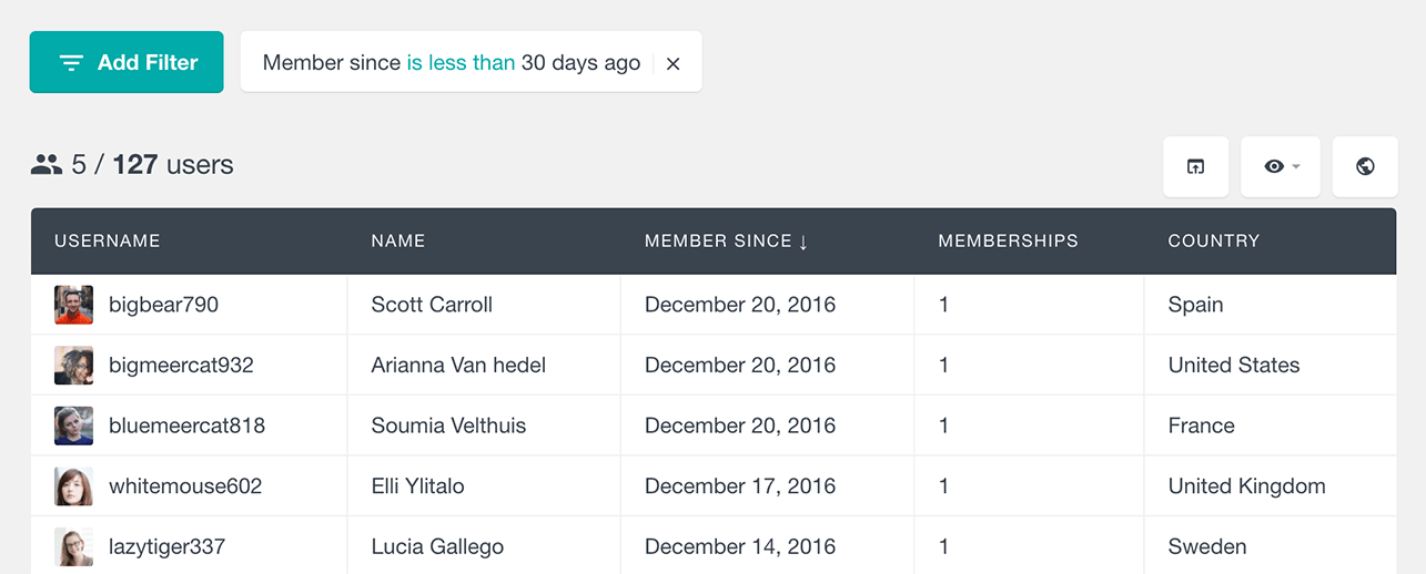
If you are using the WooCommerce Memberships plugin to run your membership site, there is a lot of data that WordPress and WooCommerce store about your members. This can be sales data like number of payments, purchase history or a simple member activity data. No matter the type, your membership data can be useful and can provide you with valuable lessons about your members and your business.
The problem is that this data is often distributed across different pages, plugins, forms and some of it might be completely hidden from our eyes. This is one of the main reasons why we have created Users Insights. To provide you with a way to put all of your WordPress user data into a single well-organized place. With the WooCommerce Memberships Reports dashboard, we have tried to present your member data in a more visual and actionable manner that is easy to understand. The reports dashboard makes it easy for you to analyze your data and get valuable insights about your membership business.
New members report
The new members report shows the number of new members subscribed over time. By default it shows a daily view, reporting the number of new members acquired for the past several days. However you can also switch to a weekly, monthly and yearly report.
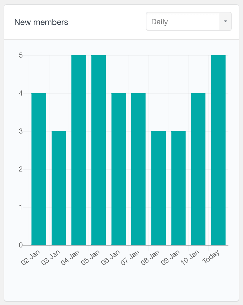
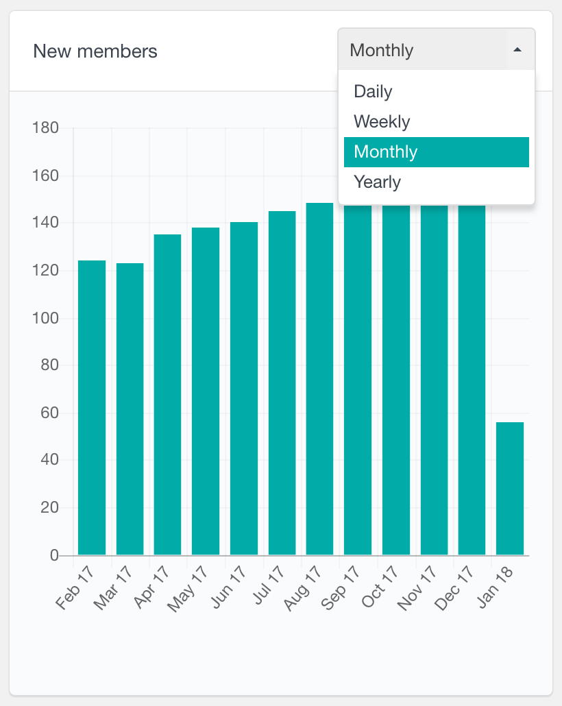
This report can be very useful to find how your WooCommerce member base is growing over time. For example, you can use it as your own monthly membership report and track your members growth by month. Additionally, if your site allows registering non-member users or you have non-membership WooCommerce products, this report can help you understand your memberships performance specifically. You could compare this report to the Registered Users report and find what proportion of your users have actually become members over time.
Ended memberships report
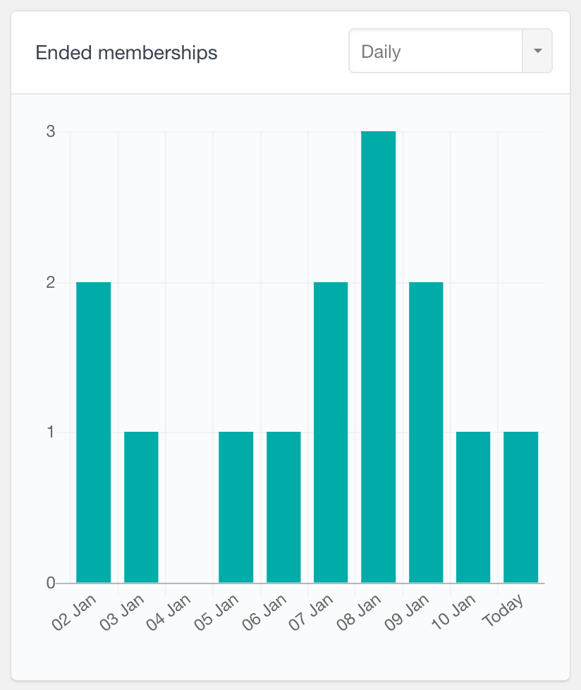
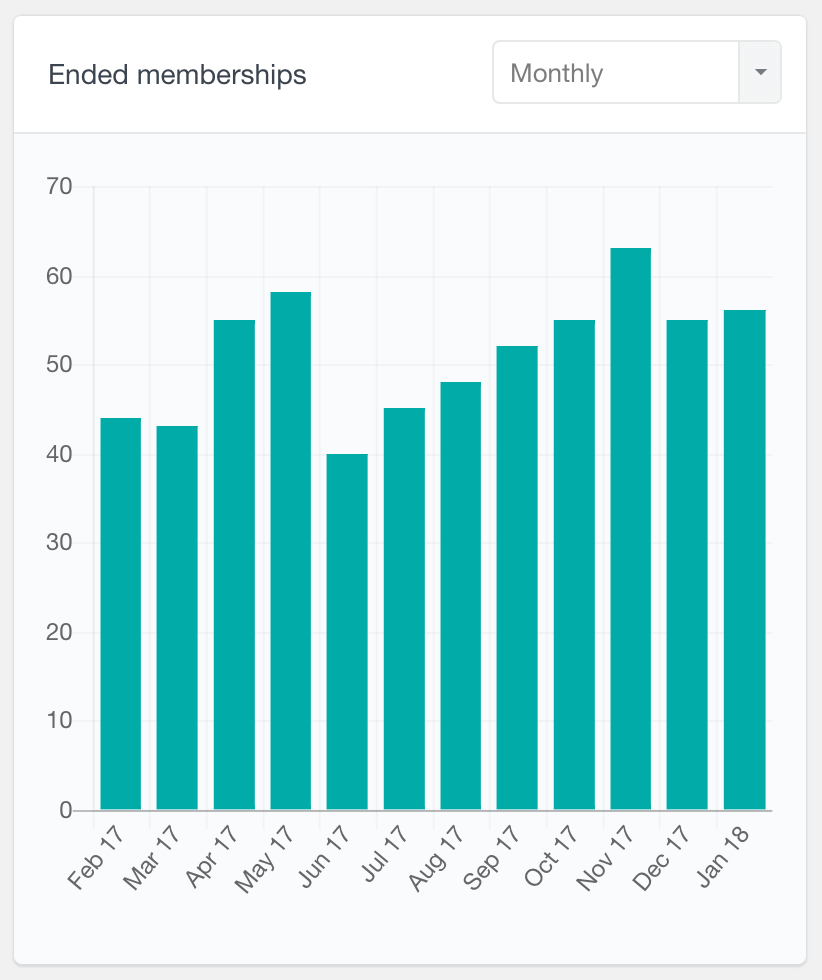
The ended memberships report represents the number of expired and cancelled memberships over time. This is a periodic report supporting daily, weekly, monthly and yearly periods.
Expirations and cancellations are a normal part of every membership site. In order to understand your membership site performance, you need to not only check the new memberships stats, but also explore how many memberships have been ended.
Number of memberships per plan report
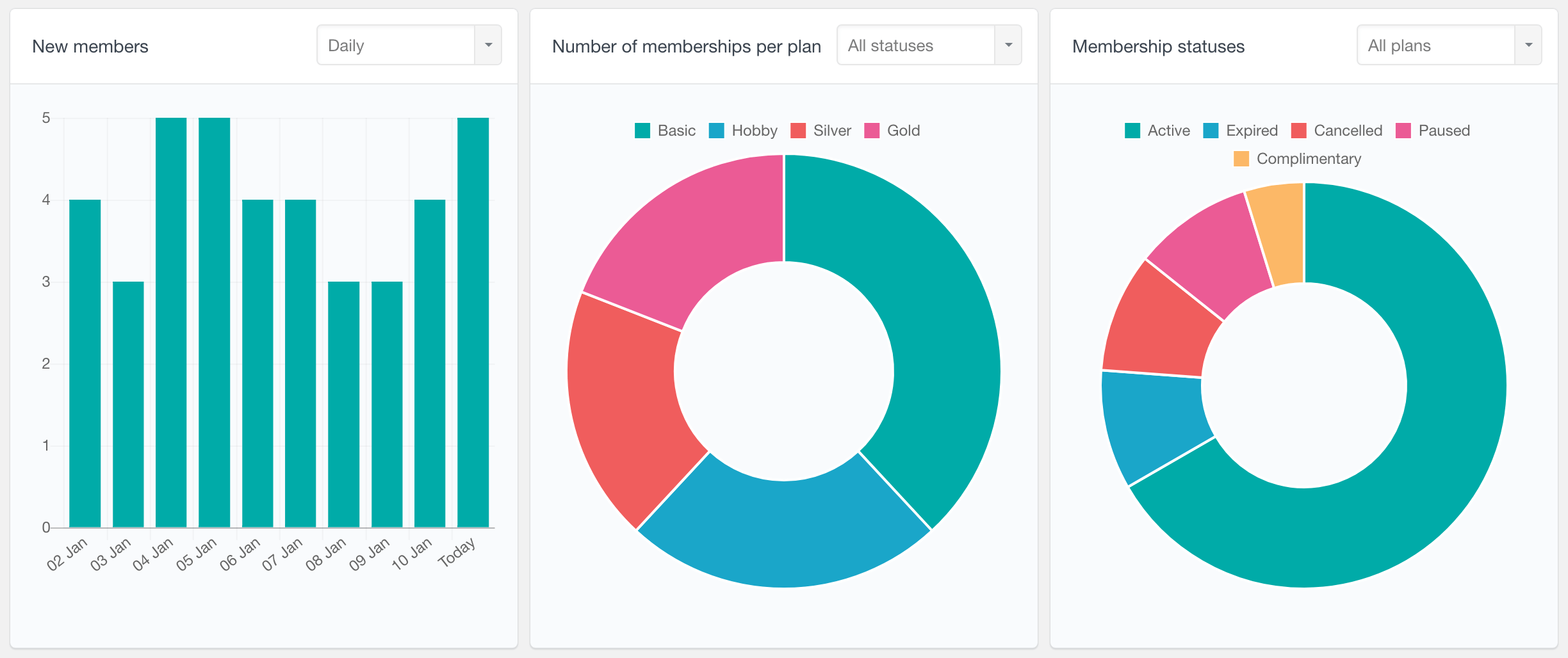
The number of WooCommerce memberships per plan report can help you compare the individual plans’ performance. It is a pie chart showing how many memberships each plan has. By default all of the statuses are shown on the chart, however you can filter the report by its membership statuses. For example, you could choose to see only the active or cancelled statuses. Additionally, hovering each slice on the chart will show you the exact number of memberships for that plan.
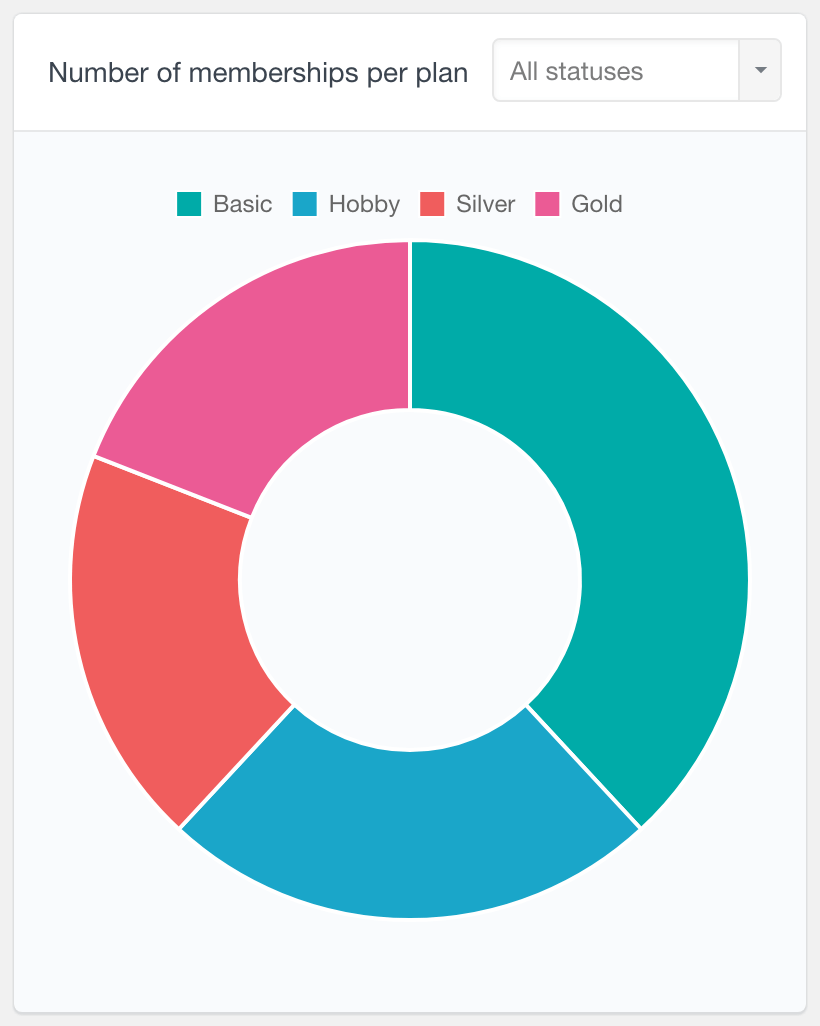
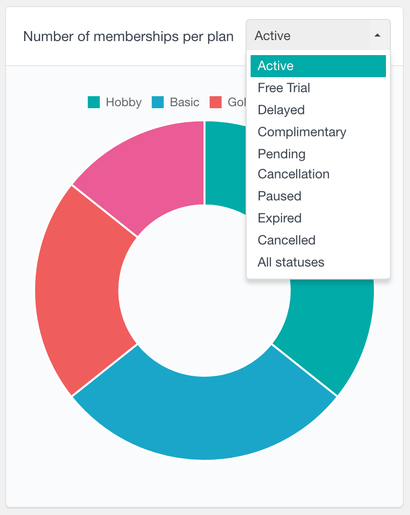
This report can help you understand which your most popular plans are. With the help of the status filtering options you can also compare the plans to each other and see which ones are the best performing in terms of active memberships.
Membership statuses report
With the WooCommerce membership statuses report you can explore the statuses of your plans altogether or individually. This report is represented as a pie chart, where each slice indicates how many memberships there are for each plan. By default all of the plans’ statuses are visualized on the chart. You can also choose to view only a specific plan’s statuses.
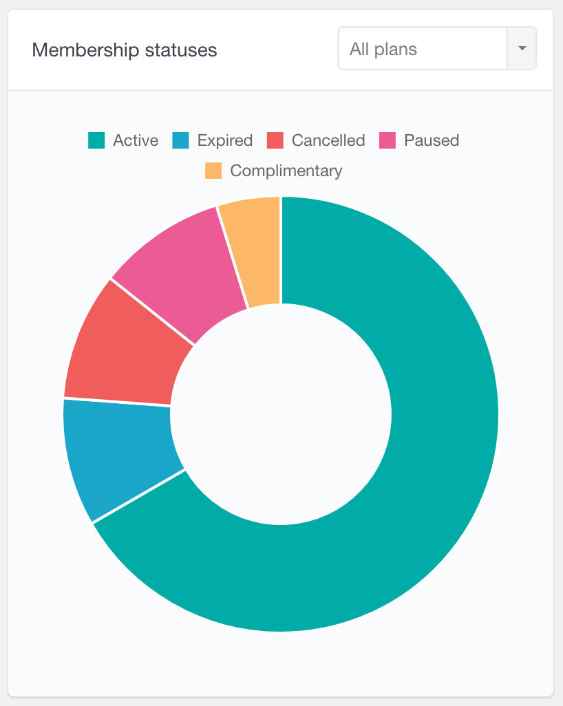
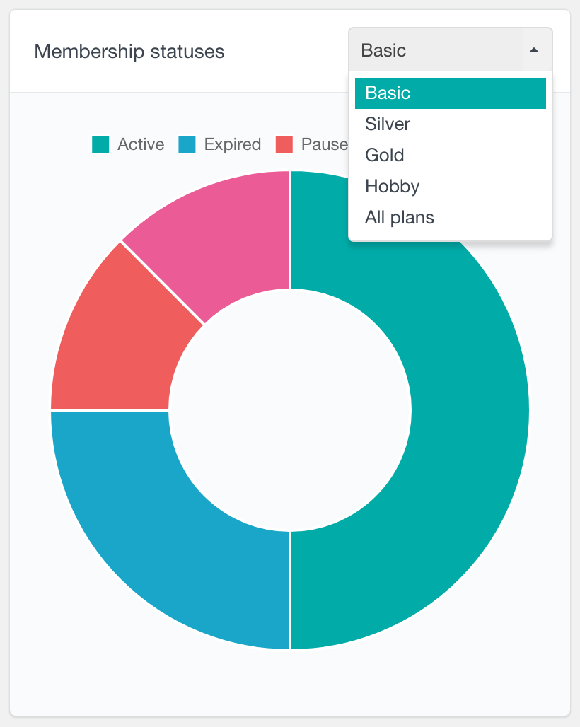
This report can help you understand how each plan is performing individually. For example, you might find that one of the plans has a much larger proportion of cancelled memberships, compared to the rest of the plans. With this knowledge, you can try to find what is causing this and hopefully decrease the churn rate of this plan.
General WooCommerce reports
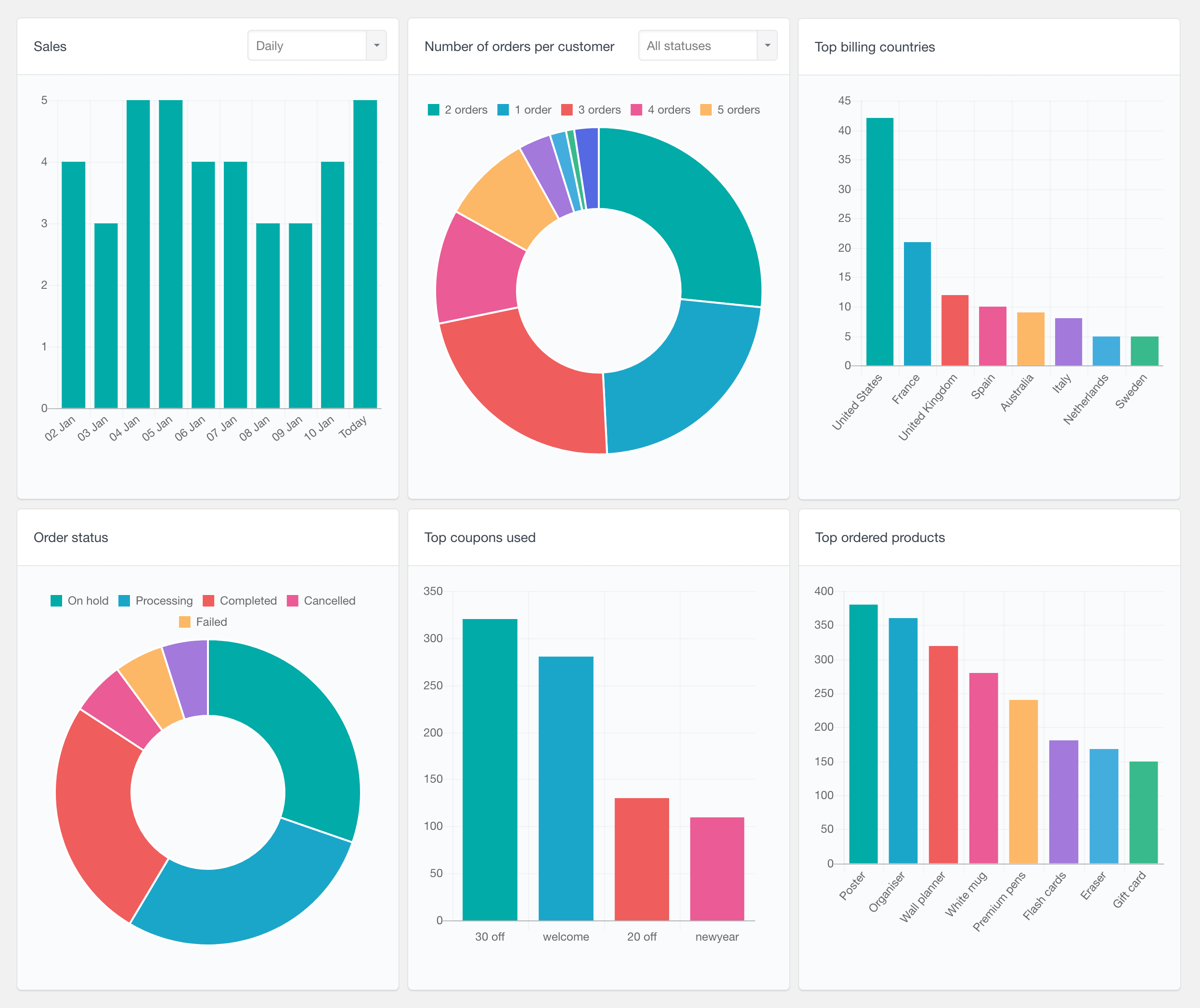
Besides the WooCommerce Memberships reports, Users Insights also comes with a general WooCommerce reports section that can show you some insights of your store’s performance overall. You can explore metrics such as your sales overtime, number of new customers over time or the most popular coupons. There are also reports that can help you analyze your customers’ demographics, such as the top billing countries and cities charts. Other metrics include best selling products, payment methods and order statuses.
To learn more, head over to the WooCommerce Reports page.
General WordPress user reports
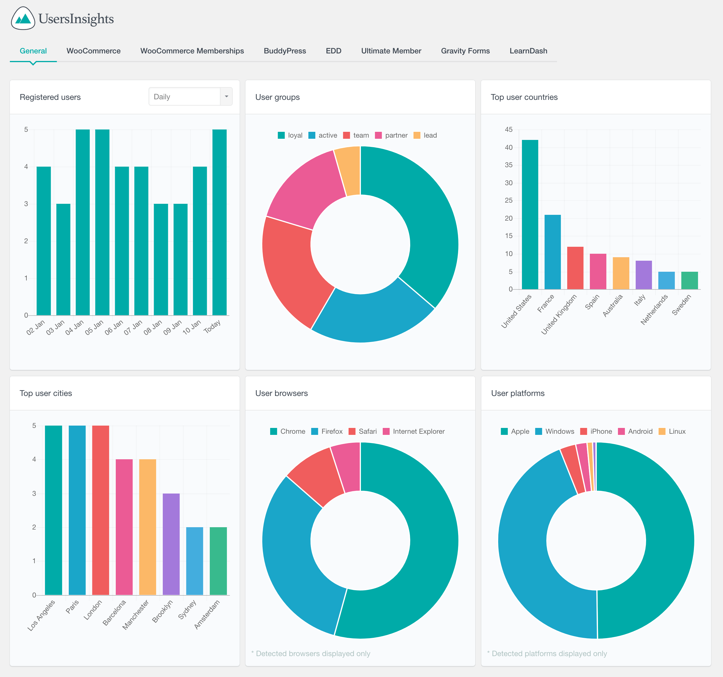
You can take your analysis process one step further by using the general WordPress user reports. With these reports you can now see your user base growth over time. The Users Insights data is also represented in various interactive charts. You can now explore metrics like your user groups, user locations and user devices.
To learn more, visit the WordPress user reports page.
WooCommerce Memberships user data and filters
In addition to the interactive charts described above, Users Insights also includes WooCommerce Memberships specific data and filters in the user table. This allows you to search and filter your users based on their memberships. For example, you can find all the members who have subscribed in a specific date range. Or you can find all the members who have an expired membership.
To learn more and see some examples, head over to the WooCommerce Memberships page.
