The BuddyPress reports feature of Users Insights is another tool that can help you analyze your BuddyPress user data. The reports can provide you with valuable insights of your community data.
The BuddyPress reports consist of two parts. The first part is the general BuddyPress reports that can show you some general info about your community, such as the most popular groups. The second part is the user profile data reports that chart the user profile data. Users Insights automatically detects the user profile fields that can be visualized in charts and generates the corresponding reports. For example, chartable fields can be the fields that require selecting one or multiple options from a list. In this way, Users Insights can detect how many times each option has been selected and create a graph visualizing the weight of each option.
Let’s see the BuddyPress reports that Users Insights provides.
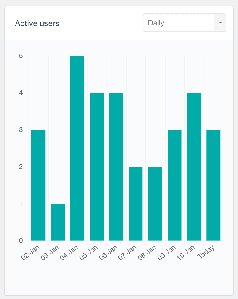
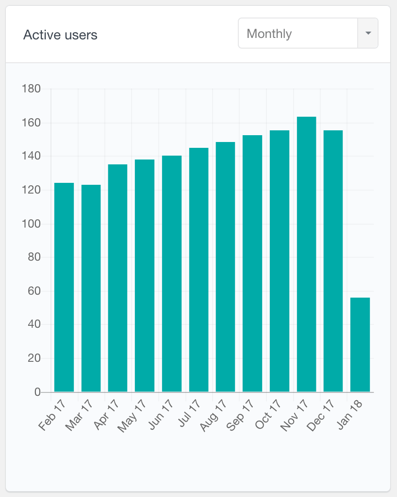
Number of active BuddyPress users report
With this report you can explore the number of active users over time. It is represented as a bar chart, supporting daily, weekly, monthly and yearly period options. A user is considered as active when he/she performs any kind of BuddyPress activity. For example, this could be posting a message, joining a group or accepting a friend request. If a user signs in, but doesn’t perform any activity, this user won’t be counted as an active user. This report can help you gain an overall idea of how engaged the users are with your website.
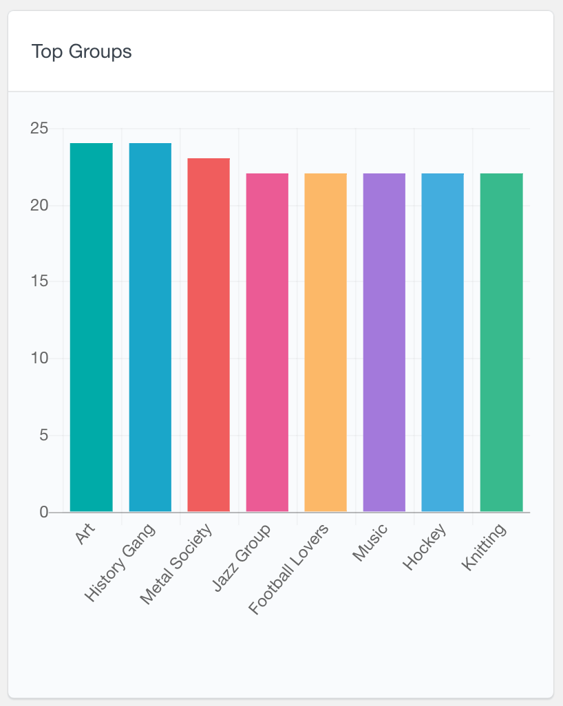
BuddyPress top user groups report
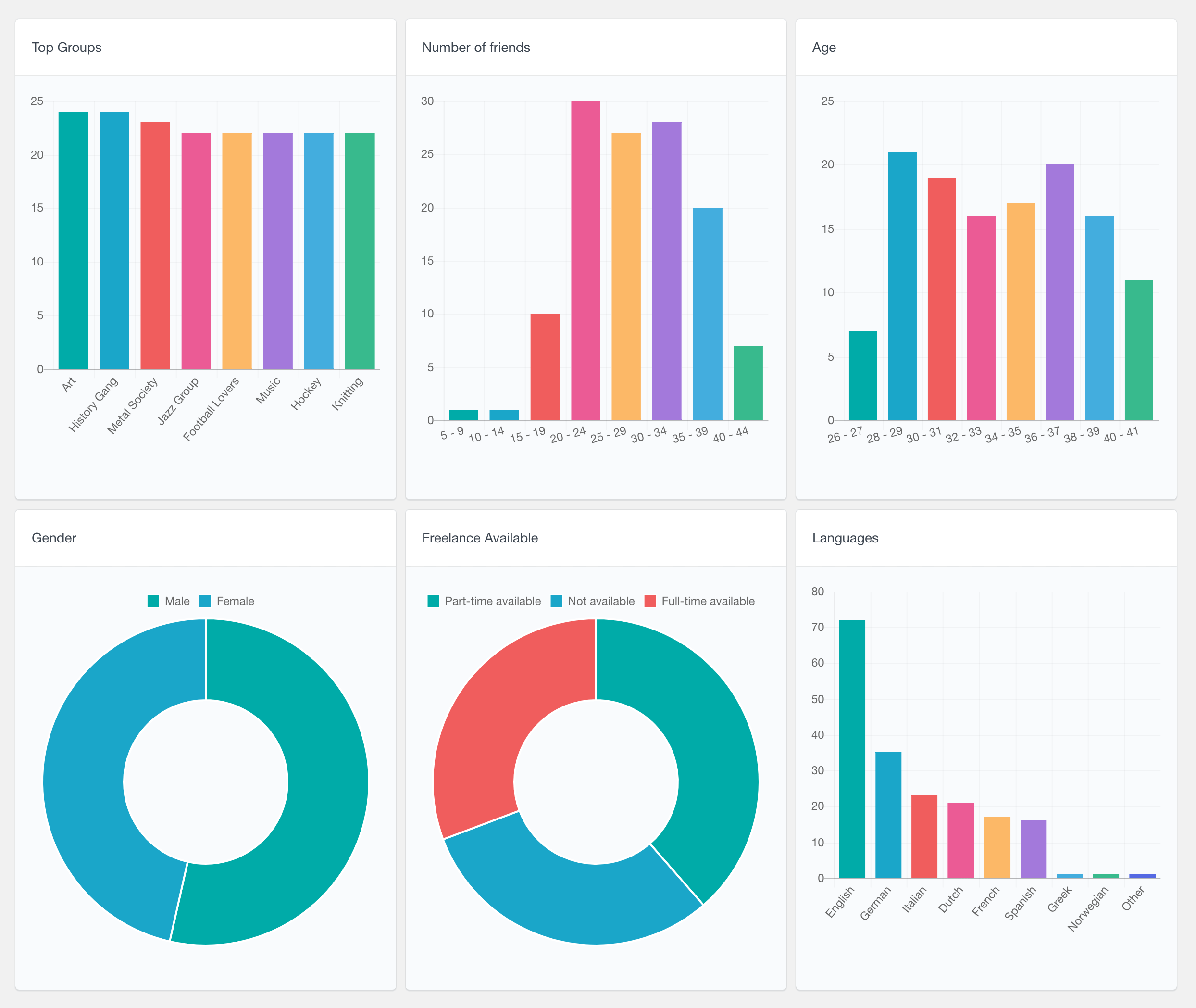
If you are using the BuddyPress groups feature, this report can show you which are the most popular groups in your community. This is a bar chart report, showing the top eight groups by default. The left axis indicates the number of users that have joined the group. You can also hover on each bar of the report to see how many users exactly the group has.
This report can be very useful to find your community’s most popular interests. It can also give you an indication on which groups you might need to focus most in terms of providing services, products or content.
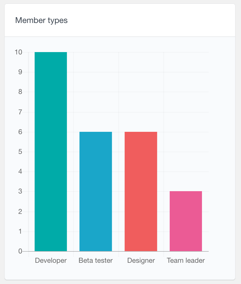
BuddyPress member types report
If you are using the Member Types feature, you can also explore your top member types in this visual report. It is a bar chart showing the number of users who are assigned to each member type. If you have a large number of member types, this report will show the top eight most popular types and group the rest of them under an “Other” bar.
Number of BuddyPress friends report
If you are using the BuddyPress friends feature, this report can show you how many friends your users have. Users Insights automatically counts the number of friends that each user has and creates ranges based on the results. In the example below, you can see that the number of friends that the users have varies between 5 and 44, where most of the users have between 20 and 39 friends.
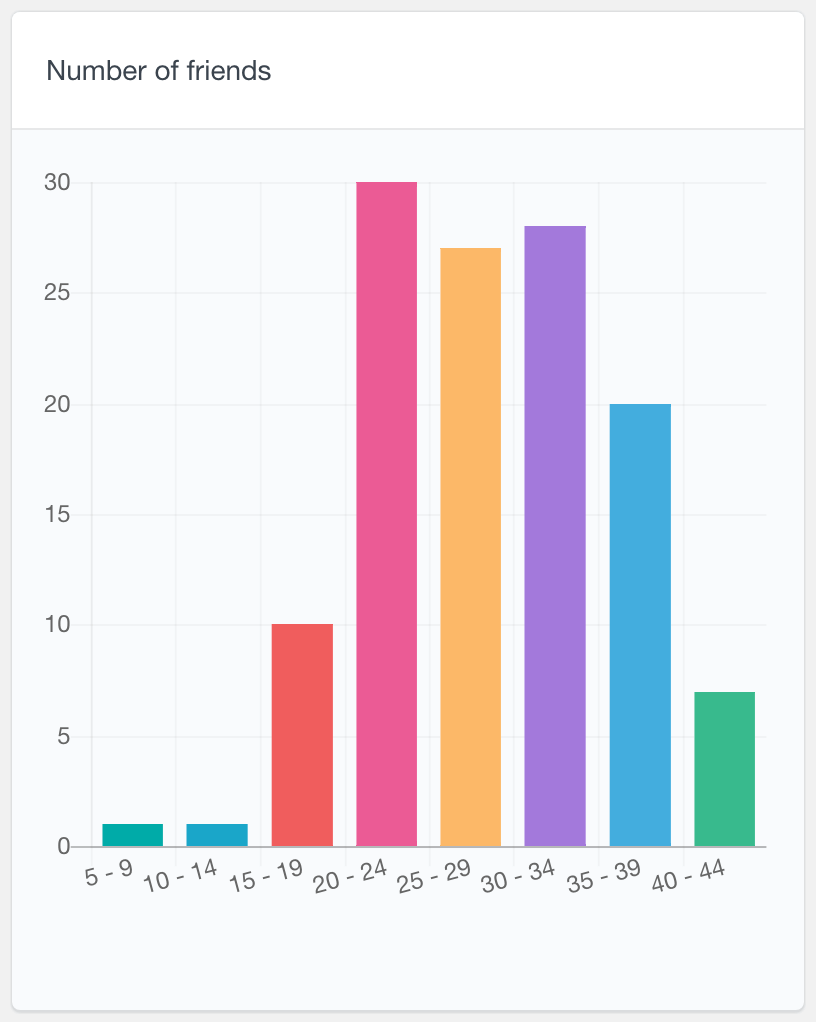
This report can help you analyze how engaged your users are in your community. In most cases a higher number of friends would mean a higher engagement.
BuddyPress user profile data reports
As we mentioned earlier, Users Insights also detects the BuddyPress user profile fields (xProfile fields) and plots their data in the reports section. The way the data is represented depends on the field type and not all of the field types can be visualized in charts. For example, simple text fields are not appropriate for charts, since they can contain an infinite number of values. However, fields with limited options to choose from can be easily visualized in bar or pie charts.
Let’s see what user profile data Users Insights provides in the reports and how it is represented.
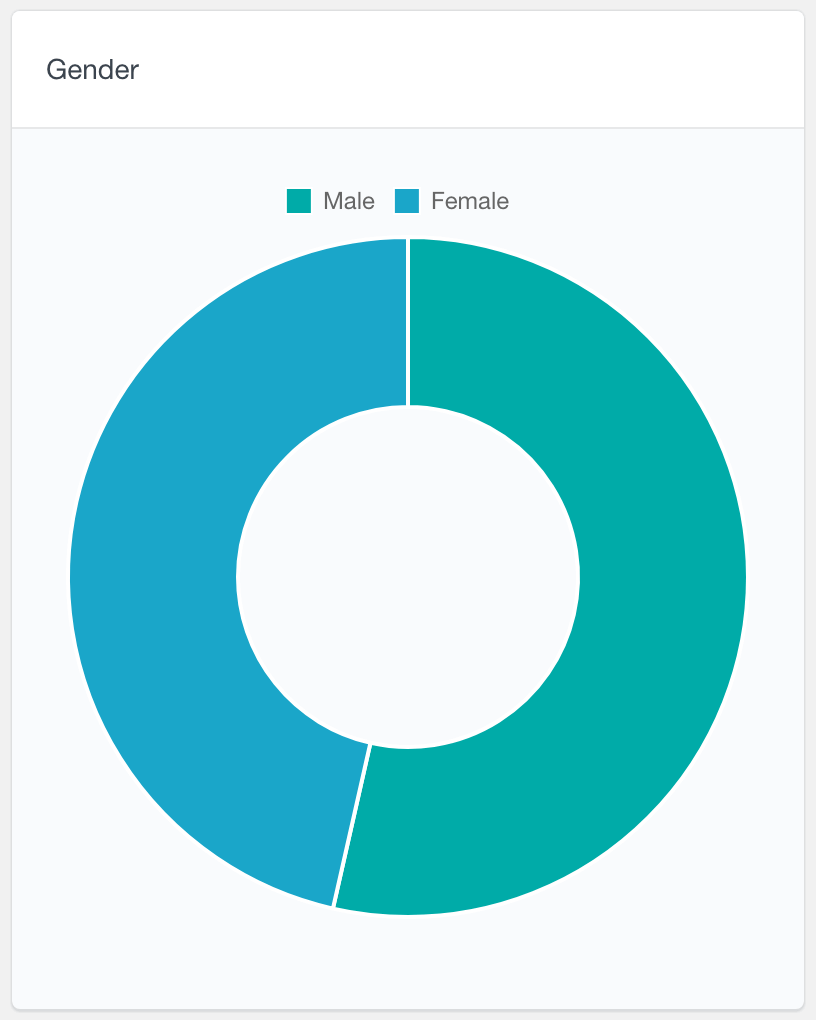
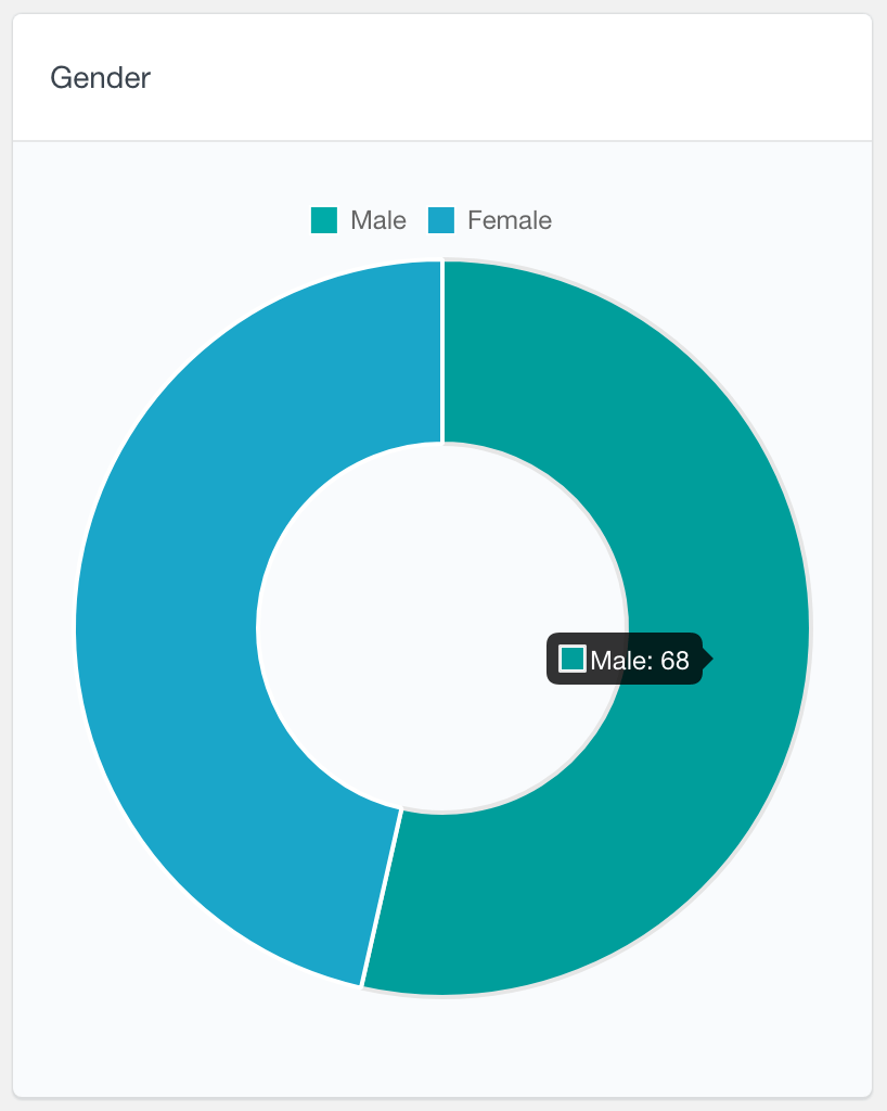
Radio buttons
The BuddyPress radio buttons field allows the user to choose one option from a set of options. This field is mostly used when there are only a few options to choose from – for example, for yes/no values.
Users Insights visualizes these reports in the form of a pie chart. Each slice of the chart represents each one of the options. Keep in mind though, that options that have not been selected won’t be displayed on the chart.
Here is an example of a chart visualizing a Gender user field. On the second screenshot you can see that hovering each of the slices can give you the number of users that have selected this option.
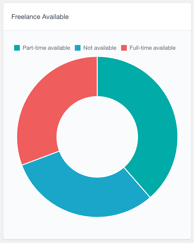
Drop-down select boxes
The drop-down select boxes are very similar to the radio buttons, in terms that they allow selecting one option from a set of options. The difference is that this type of fields is usually used for data that allows a larger number of options to choose from.
Users Insights visualizes these fields as pie charts. By default it displays only the top several options, so it won’t make the chart too overloaded. The rest of the options that are not that popular would be grouped under an “Other” section.
The following example demonstrates a drop-down select field where the users can choose their availability:
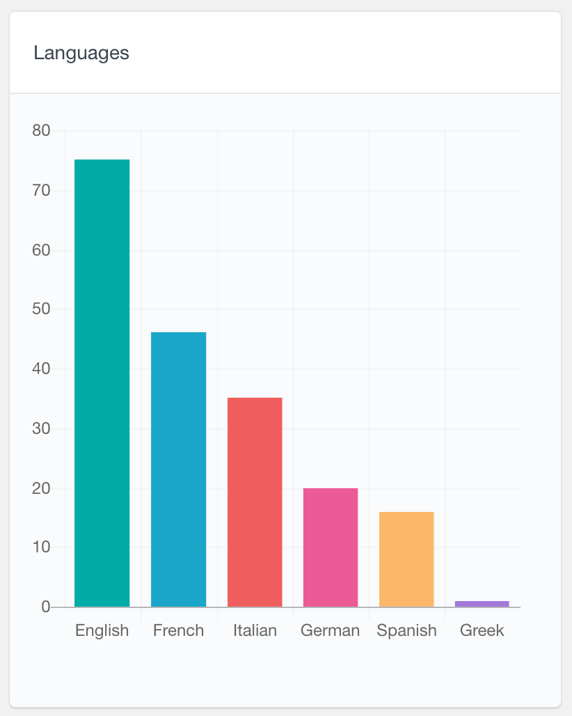
Checkboxes and multi-select boxes
With this type of fields, the users can select one or more from the available options. Users Insights represents this type of data in the form of a bar chart. Each bar of the chart represents how many users have selected the corresponding option. Similarly to the above-mentioned reports, this report shows the top several most popular options and groups the rest of the options under an “Other” section.
Here is an example demonstrating a “Languages” field, where the users can choose all of the languages that they speak.
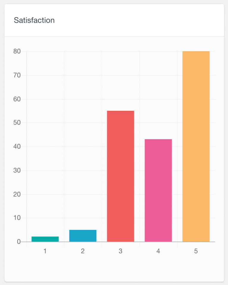
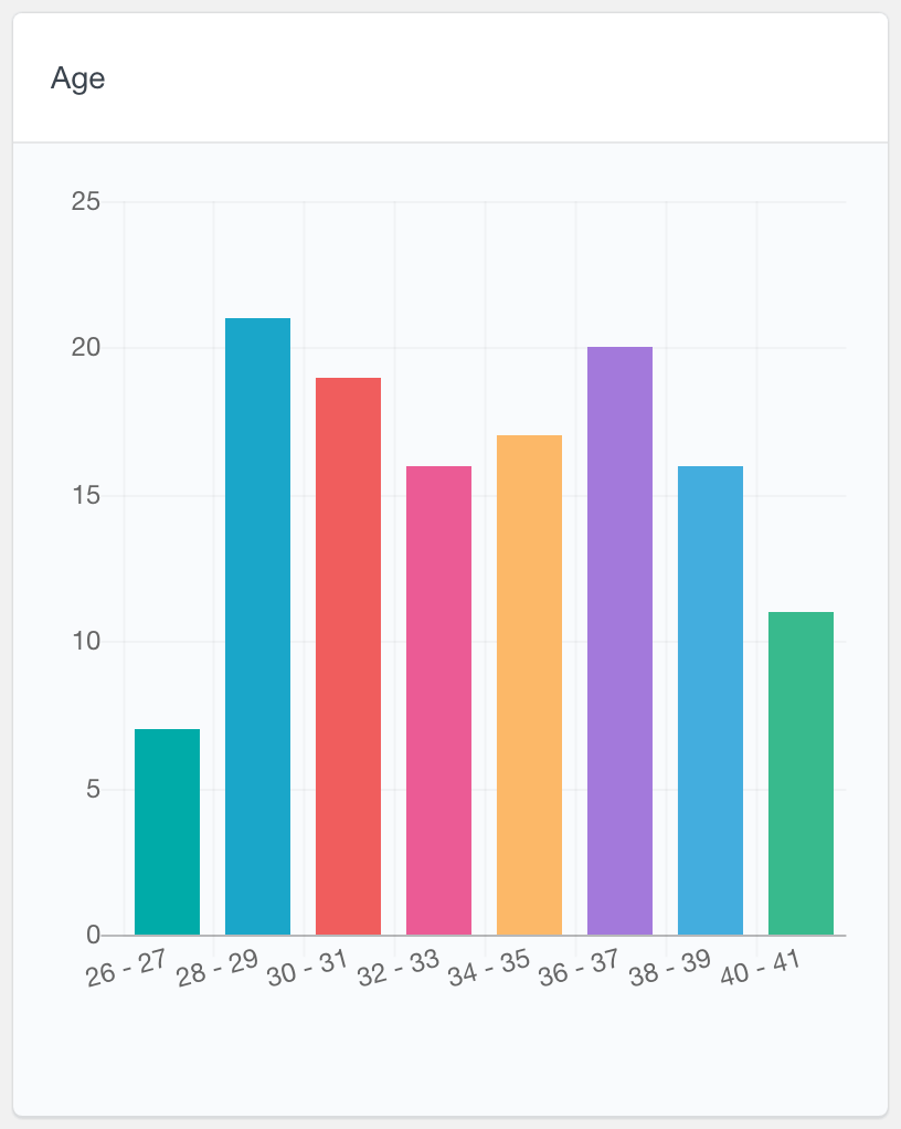
Number fields
Another BuddyPress user field that Users Insights supports is the number field. The number field report is represented with a bar chart. The way Users Insights represents the data depends on the values that the users have submitted. By default, if there are up to eight unique values, each of these values would be represented in a separate bar on the graph. An example, would be a rating field of the user’s satisfaction that can range from 1 to 5. If however, the submitted data contains more unique values, it would be represented in ranges. The ranges are automatically generated, based on the values of the data.
The following examples illustrate both scenarios. The first screenshot shows a report of a satisfaction field that accepts values from 1 to 5. The second screenshot shows a report of an Age field. As you can see, since there are numerous different values for this field, they are broken into ranges.
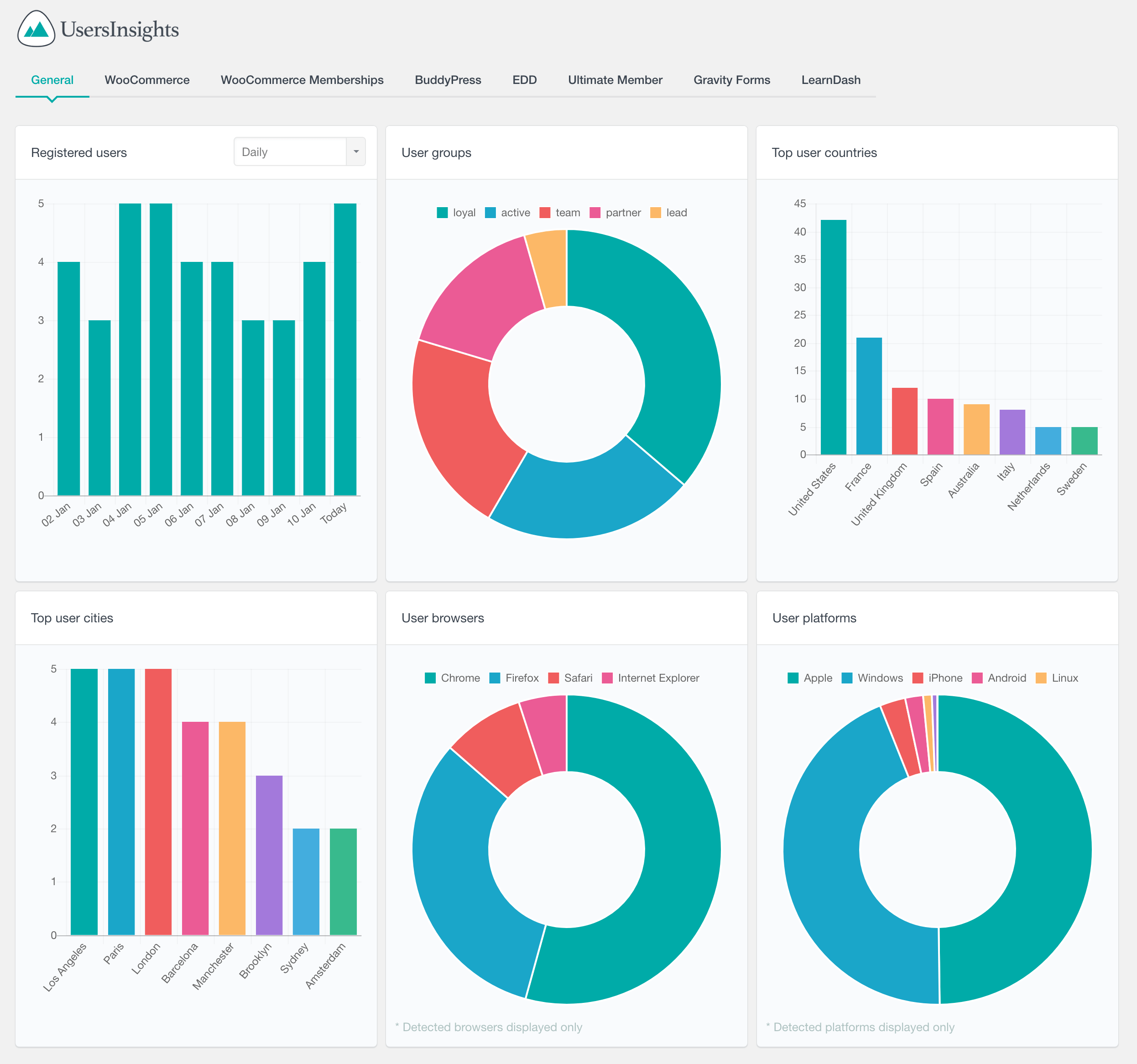
General user reports
Users Insights also comes with a General reports section that includes some general WordPress user reports, as well as reports for the Users Insights data. With the registered users report, for example, you can monitor your user base growth overtime. Or if you want to find where your users come from or what devices they use, you could check the reports of the data that Users Insights generates. Users Insights also includes reports for other 3rd party plugins, such as WooCommerce or LearnDash.
To learn more about all of the available Users Insights reports, you can visit the Reports page.
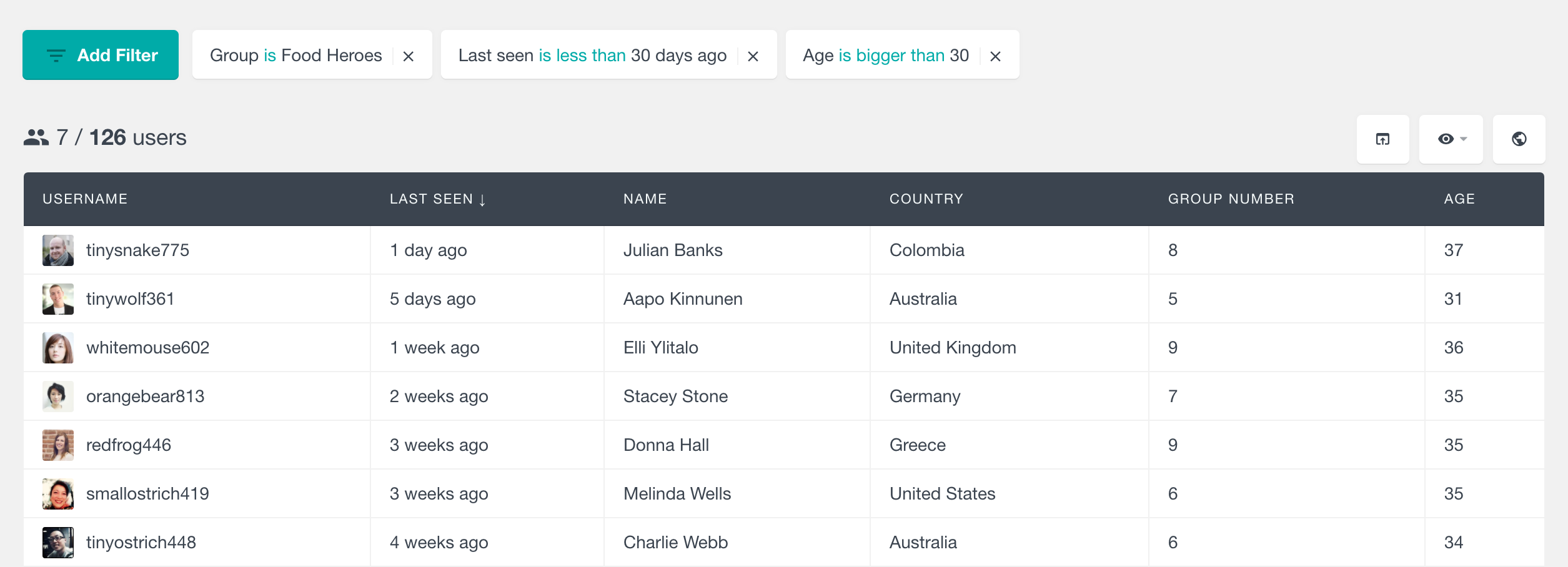
BuddyPress user search and filters
If you need to search your user base and observe the individual user activity, you can additionally use the Users Insights user table, filters and profile page. With the advanced filters, you can search your users based on their activity and user profile data. You can also view a detailed overview of the each user’s activity and information in their Users Insights profile. To learn more about all these features, head over to the BuddyPress module page.