One of the key features of the Profile Builder Pro module of Users Insights is its automated reports. Users Insights automatically detects all the fields that can be structured in a chart and makes them available in the reports section. This includes fields such as the select and checkbox fields. Let’s go through each of the report types and see how they work.
Radio and Select field reports
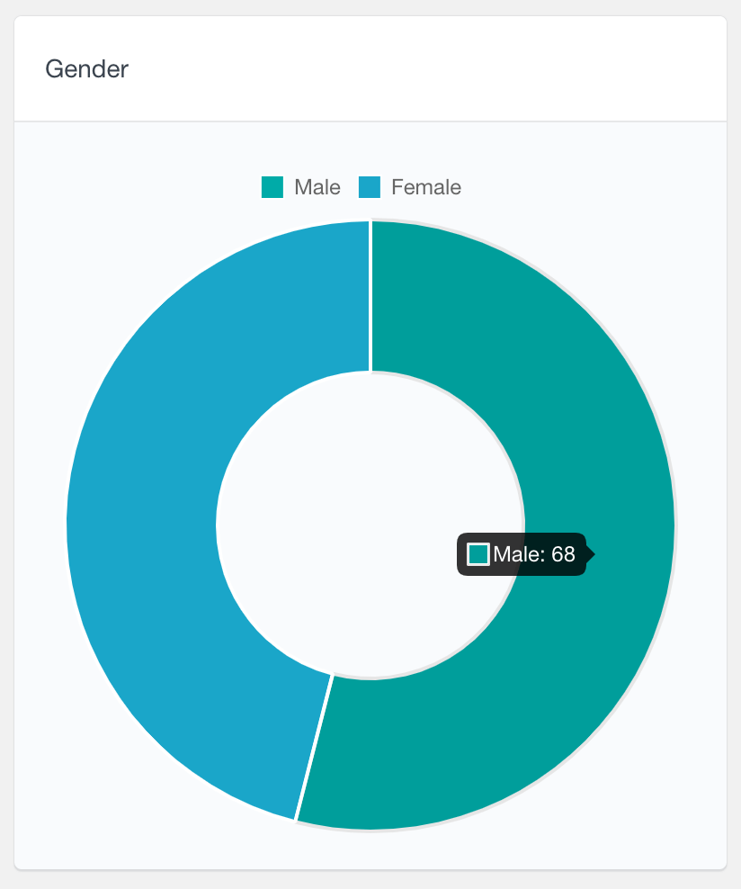
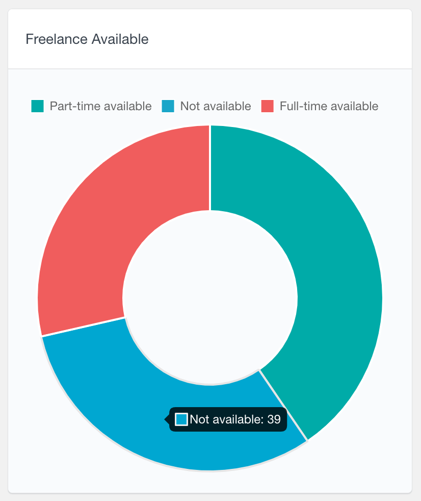
With the Profile Builder Pro Radio and Select fields, the users can choose one option from a predefined set of options. Since each user can have only one value for the selected field, this data can be best presented with a pie chart. The proportions of each of the values that the users have created are visualized as slices on the pie chart. For example, if you have a Gender profile field, you can see the distributions of your WordPress users by their gender. When the fields support a high number of values, the top 8 values are presented on the chart and the rest of them are grouped under an “Other” slice.
The following two examples illustrate reports of the data from a “Gender” Radio field and a “Freelance Available” select fields. Hovering on each element will show you how many users have the corresponding value selected.
Checkbox and Multiple Select field reports
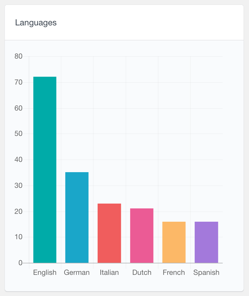
For the fields where the users can select more than one value from a predefined option list, Users Insights will generate a bar chart report. Each bar represents the number of users who have selected the corresponding value. Similarly to the pie chart reports, only the top 8 values are represented on the chart and the rest of them are grouped together.
On the following screenshot you can see an example of a Multiple Select field data in Profile Builder Pro. As you can see, this report can be very useful to find the most popular options that your users have selected for the corresponding field.
Number fields
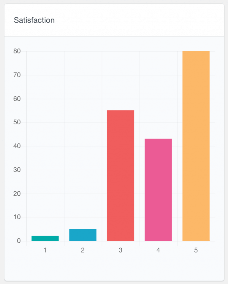
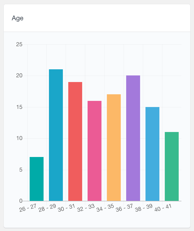
The reports that Users Insights generates for your Profile Builder Pro number fields can help you to easily find the distribution of the values that your WordPress users submit. These reports are represented in the form of bar charts where:
- when there are 8 or less different values, each bar on the chart will represent the number of users who have entered the value
- when there is a higher number of different values, they will be grouped together in ranges
The following two screenshots illustrate these two scenarios. As you can see, on the first example, there is a Satisfaction field with a maximum allowed value of 5 and each bar represents how many users have the corresponding satisfaction rating. The second screenshot on the other hand represents the data from an Age field, where the values are grouped in ranges. The size of the range generally depends on the data. For example, larger ranges will be created when the difference between the minimum and maximum values is larger.
General WordPress user reports
Other than the reports that Users Insights generates based on the Profile Builder Pro data, there are many other reports that can help you visualize your user activity and data. These include reports like registered users over time or reports from other supported 3rd party plugins, such as WooCommerce. You can learn more about all the available reports on our Reports page.
Further exploring the Profile Builder Pro user data
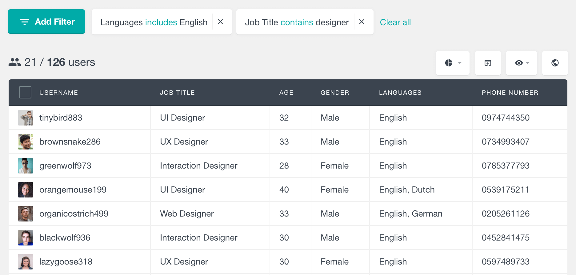
While you can use the reports to get a structured overview of your user data, you can also use the Users Insights table and filters to further analyze your Profile Builder Pro data. The Profile Builder Pro fields are available in the user table, so you can easily explore and search your WordPress users based on these fields. Additionally, you can also view the field data for each user in their profile. For more information, head over to the Profile Builder Pro module page.